I actually posted some of my process work from a
previous post before. My social issue was computer addiction/excessive use of computers which I decided to pick as i do frequently use the computer and it helps since my goal is to convince myself. With my final choice in
Can't Turn It Off my intention was to bring awareness to the issue by giving the audience a different POV which they're not use to. I tried working with a lot of contrasts (from left to right) and repetition to echo out my point. My problem with the end result of this project is that i didn't explore enough variations as I already tied myself to this idea with little edits here and there. But I don't know if it stands out or even totally affects you the viewers in someway.
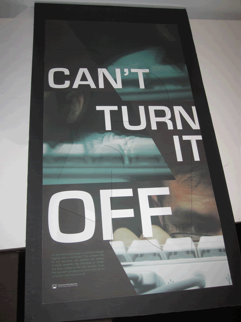 I am pretty happy with the final result I guess if i had more time to fix it up and possibly change the direction of the layout.
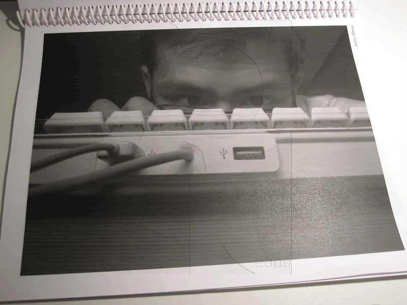 lol this was funny, taking pictures 2 in the morning. Have you ever seen how you look when your still online late into the morning?
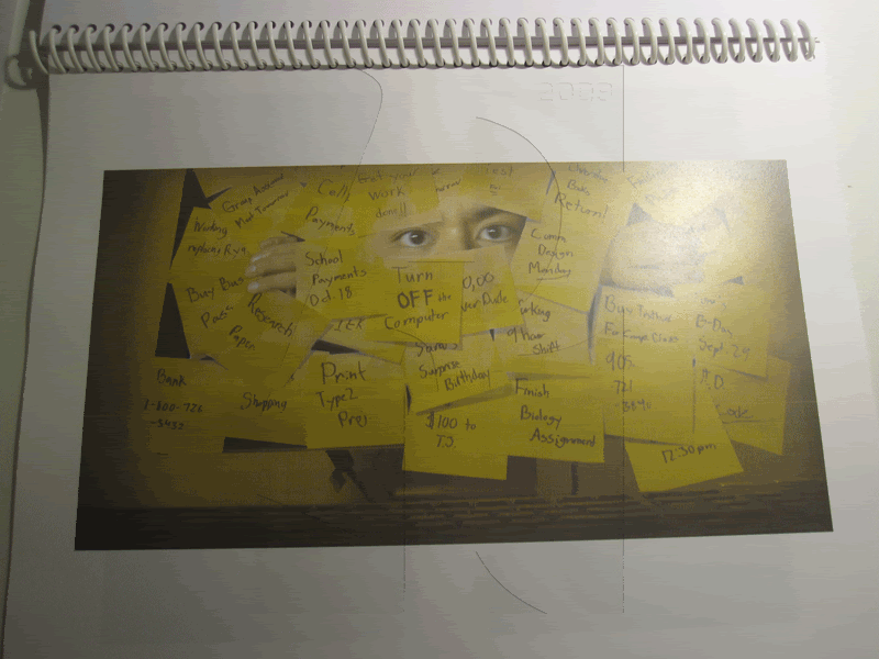 This was my other option i came up with but i dunno if it had much impact like the final design.
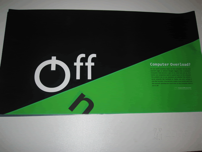 These were also part of my proj as Approach 1 just using typography to present the message
.
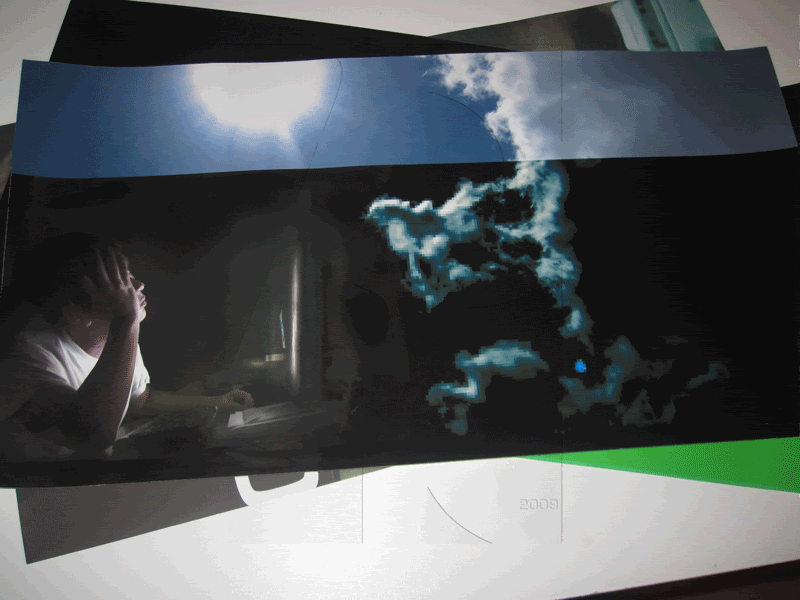 Imagery with Approach 2 was a lot harder and you can see where i was masking the image (something I have to look into next time when I'm printing).
Previous Posts:
In Process–Comm. Dsg. Persuasion,
Update on the past 3 weeks
 I am pretty happy with the final result I guess if i had more time to fix it up and possibly change the direction of the layout.
 lol this was funny, taking pictures 2 in the morning. Have you ever seen how you look when your still online late into the morning?
 This was my other option i came up with but i dunno if it had much impact like the final design.
 These were also part of my proj as Approach 1 just using typography to present the message.
 Imagery with Approach 2 was a lot harder and you can see where i was masking the image (something I have to look into next time when I'm printing).


No comments:
Post a Comment