
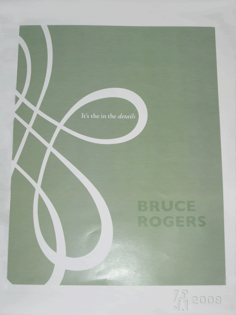
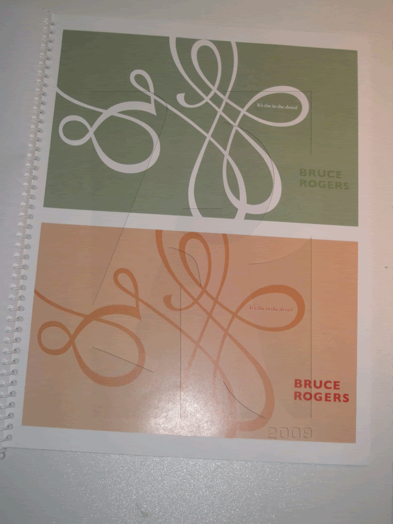
 Front Cover, Bruce Rogers was a perfectionist (like any other designer)
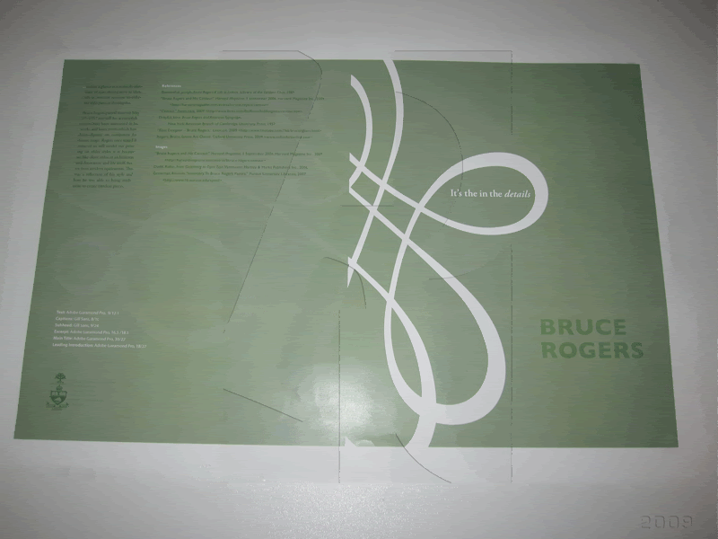 Front & Back Cover
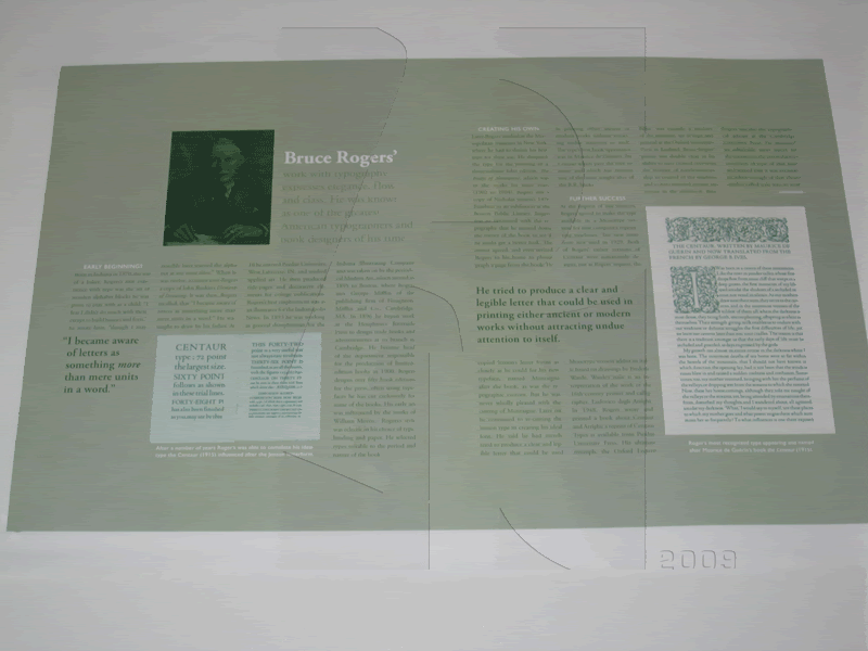 Inside content, I was only allowed to use 1 colour (even if its black). I chose green since it felt like a natural and traditional colour.
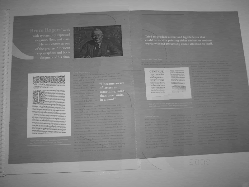 Process work, these are some of the first layouts I came up with.
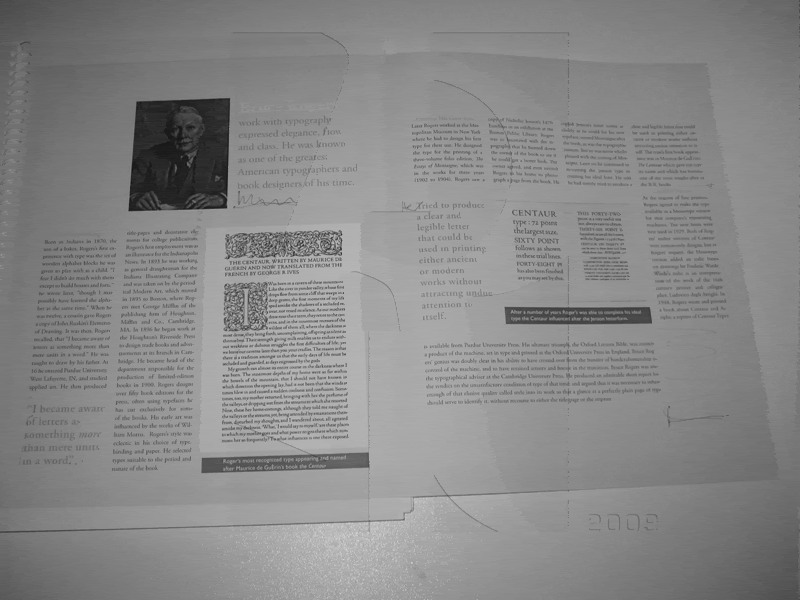
 Other colours I was thinking of using before the final print.
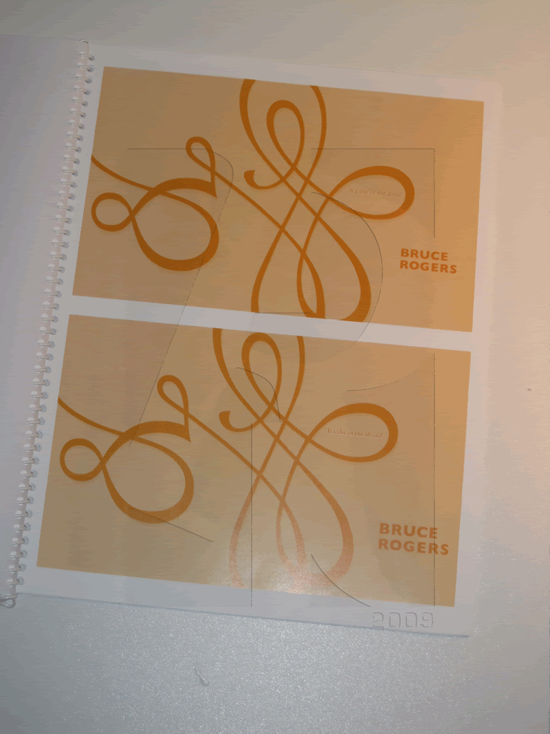 The cover features a part of Roger decorative Ampersand (&). Used it since it had so much flow and had elegance.


No comments:
Post a Comment