Been working on this project for the last month and now in the process of finalizing it. The project is aimed at the target
18-24-year-old (University Students) audience as well as a broader 16-34-year-old audience. The content is based on a
social issue but I'll explain the subject matter after since I want you to look at these posters to
see what stands out to you and the
first thought that comes to mind...
Click to see the actual (21.5 x 11.5) size
A1
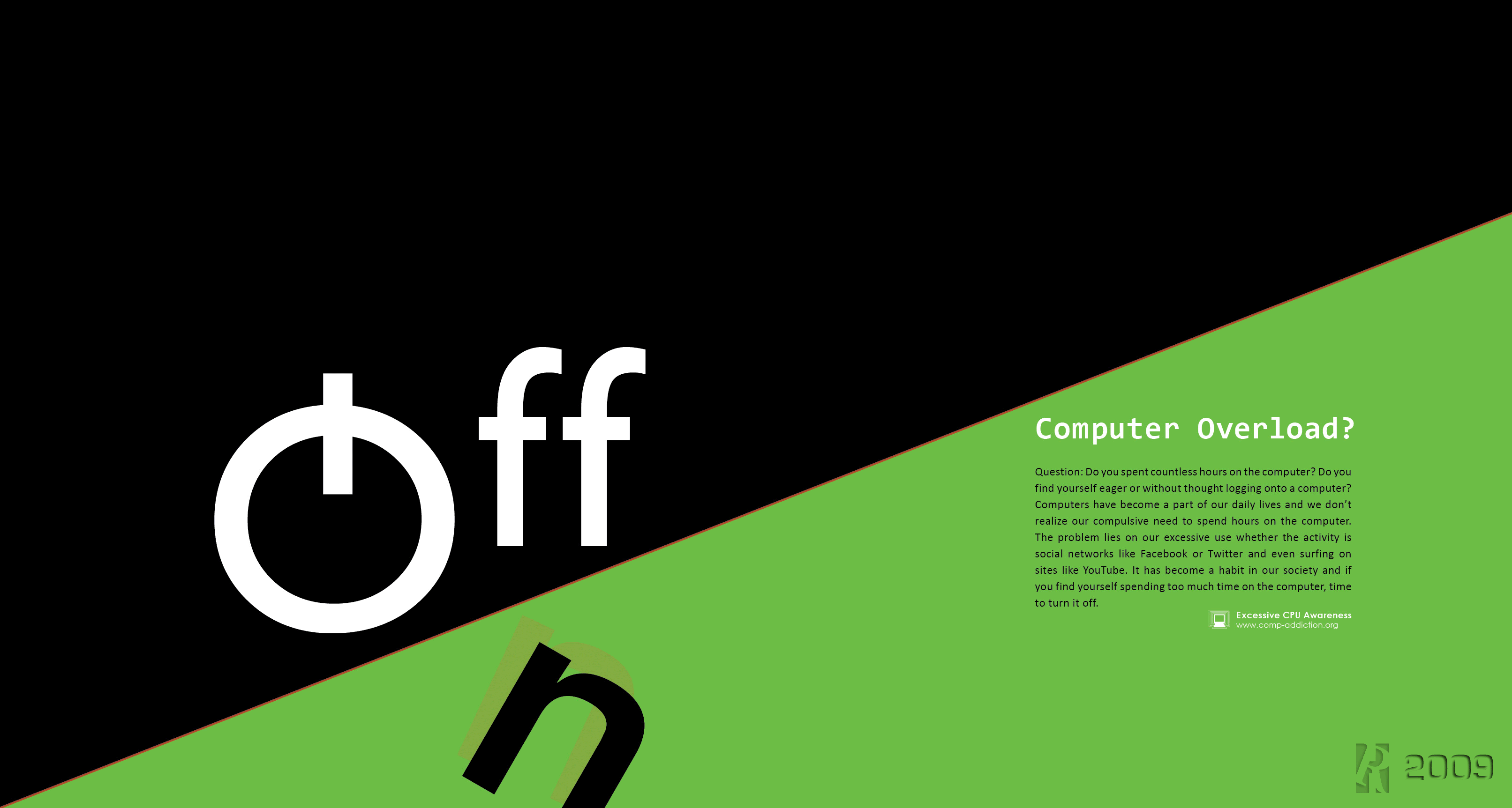
A2
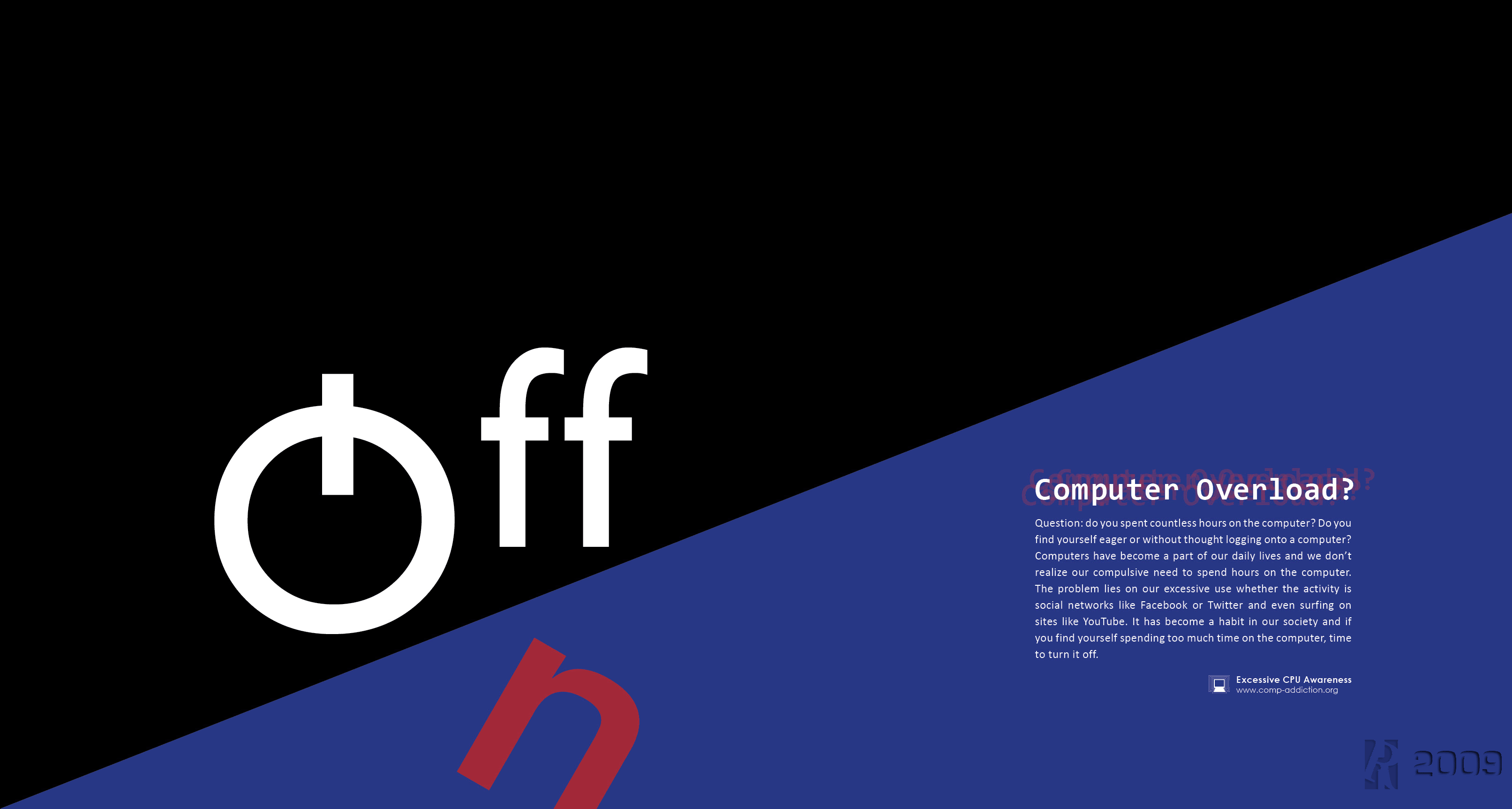
B1
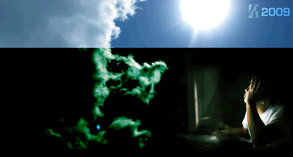
B2
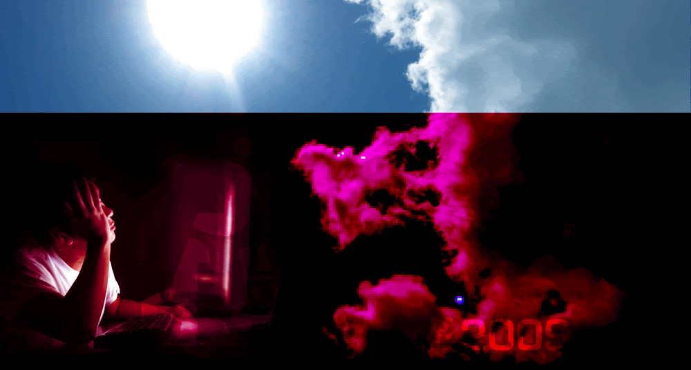
B3
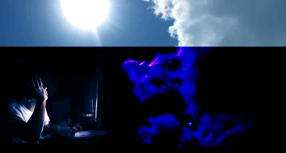
B4
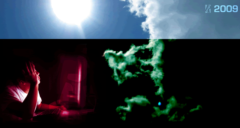
C1
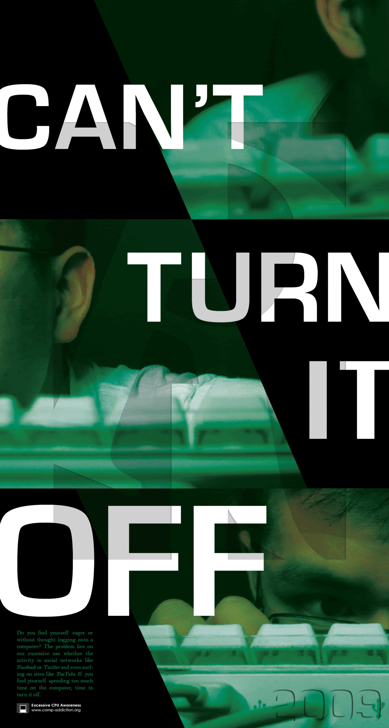
C2
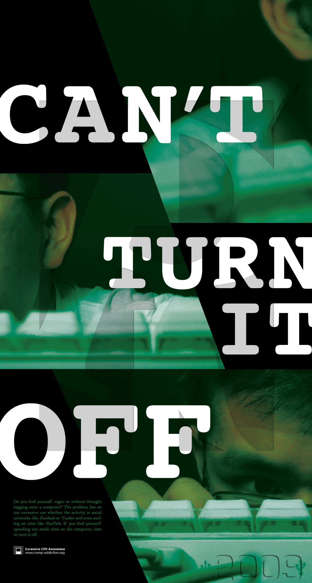
The subject matter is about
"computer addiction" or the
excessive use of the computer. This project consist of 3 posters (3 aproaches - A,B,C) which focuses on Typography, Imagery, & both Type x Img.
Wanna hear
your opinion, so I can make more improvements and see if it is effective to you the viewer.


2 comments:
a1, b2 and c1 :)
BTW awesome posters!
goodluck on the project and have a good reading week :)
- With the A's i picture more of like those ads you see on a bus. I think i bit too much blank space?
- The B's look like a pamphlet for like an "are you too stressed come join our cult/church" type of deal
- Now the C's I love. It's almost like comparing cpu addiction to drug addiction. And you look pretty addicted. It's the first thing that comes to mind when I glance at it. If I had to choose I'd say the first one because i like the typeface better.
hope this helps!
Post a Comment