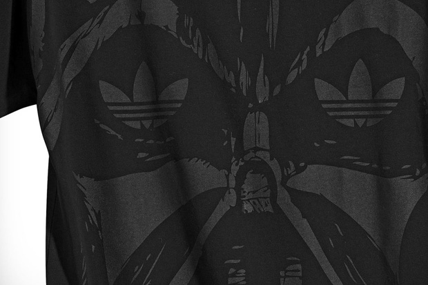
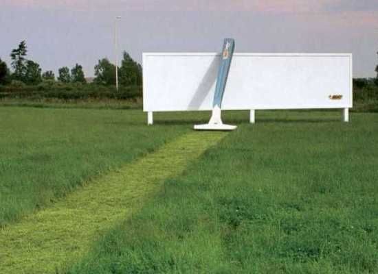
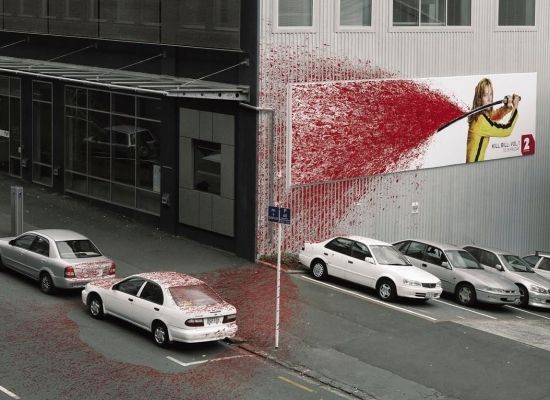
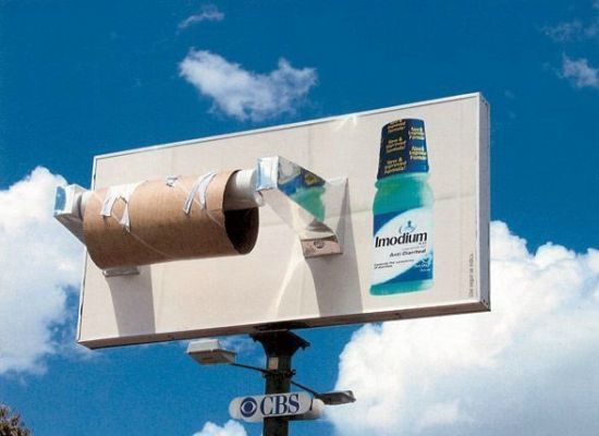
Effective?

How bout...


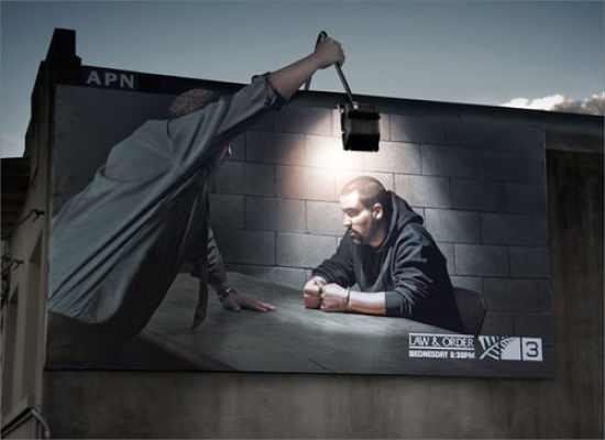
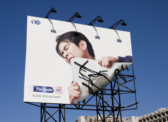
By Shoot The Glass, Check out more here
Source: Design You Trust, minimalistapproach.ch

 Swagger CREW!
 Introducing Royal Flush
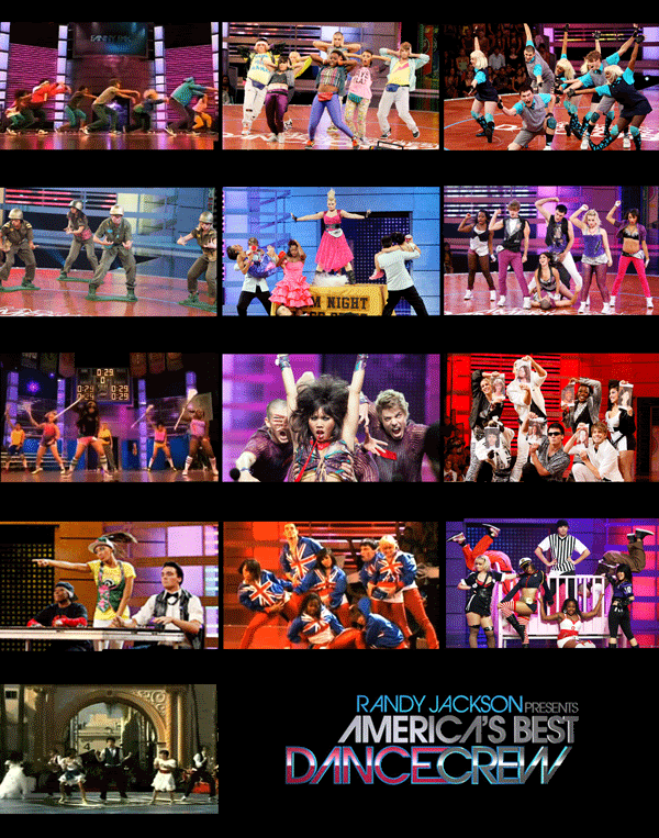
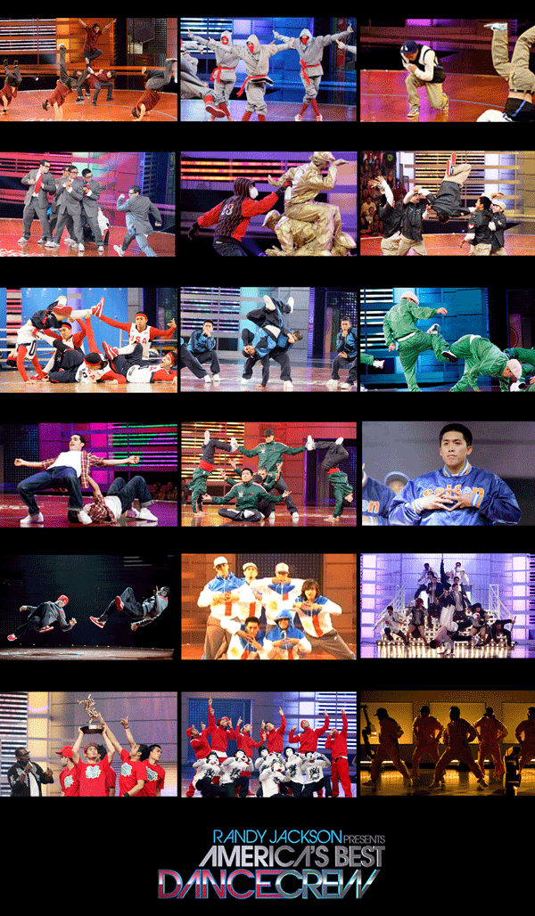
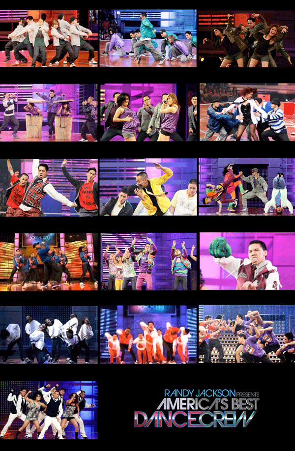
 Ah-back to the regularly schedule posts! ABDC is back for their 5 Season and all I expect is greatness and pushing the direction of the competition far away from last season. Starts Sunday January 31 (Canada) BUT! With season 3 i was able to find YouTube clips Friday morning after the Thursday showing in the States.


 Second week going into the Winter Semester with 6 courses, 4 days a week. Already piled with readings for two design lecture courses and three studio courses. AND now with the green to go with a Strike for Ontario Colleges again I'll be affected again, but hopefully it won't be as bad as York last year (way too long). Now off to the PROJECTS!
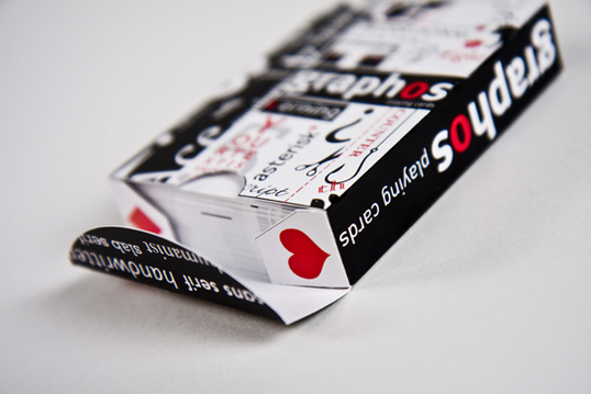
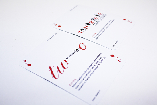
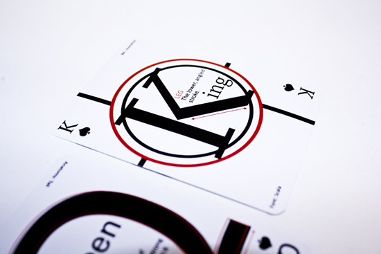
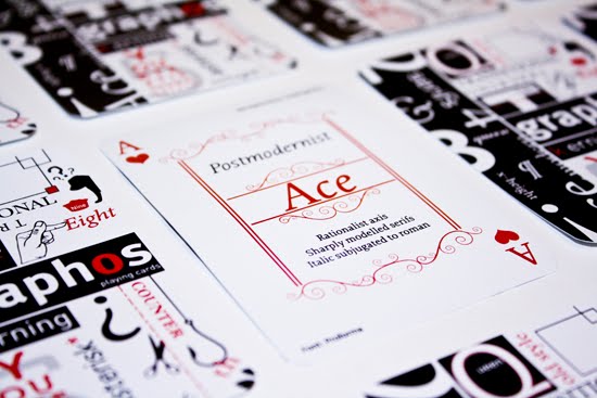
 A preview on my first Project for Typography 3.
 Taking pictures at Sheridan (Oakville) for an upcoming project.
 First project up on display from last year's Drawing for Design class. Previous Post
 ...I'll get back to you later.
 Never imagined hearing my voice on the radio or for that matter calling and getting through. Random Tuesday morning during the start of my holiday break I got up around 7am getting ready while listening to Flow and they had a contest for Alicia Keys tickets. Its the usually contest where they sample 5 secs. of 5 songs and you would have to name the artist and title. It was just insane got so nervous when I got through my reaction was blank.
 Making sure i got each song down while I was calling. It was funny cause I was still half awake while writing this.
 Finally made a trip downtown to make it official!
It's only human to have moments of fear
and feelings of being uncomfortable
but we must learn to push ourselves
beyond our own edge.
Design what you love toreplace what you hate.
 This was the main visual i was trying to achieve, the stage, the energy, the flow, and artistry that the show presented.
 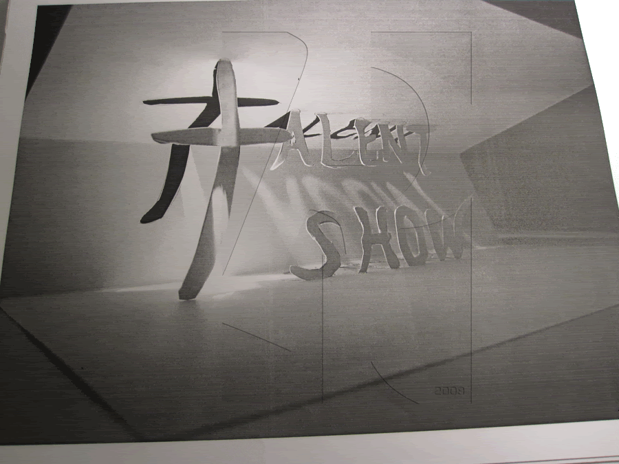 This was my second approach playing around with the pop-up but i found it too serious.
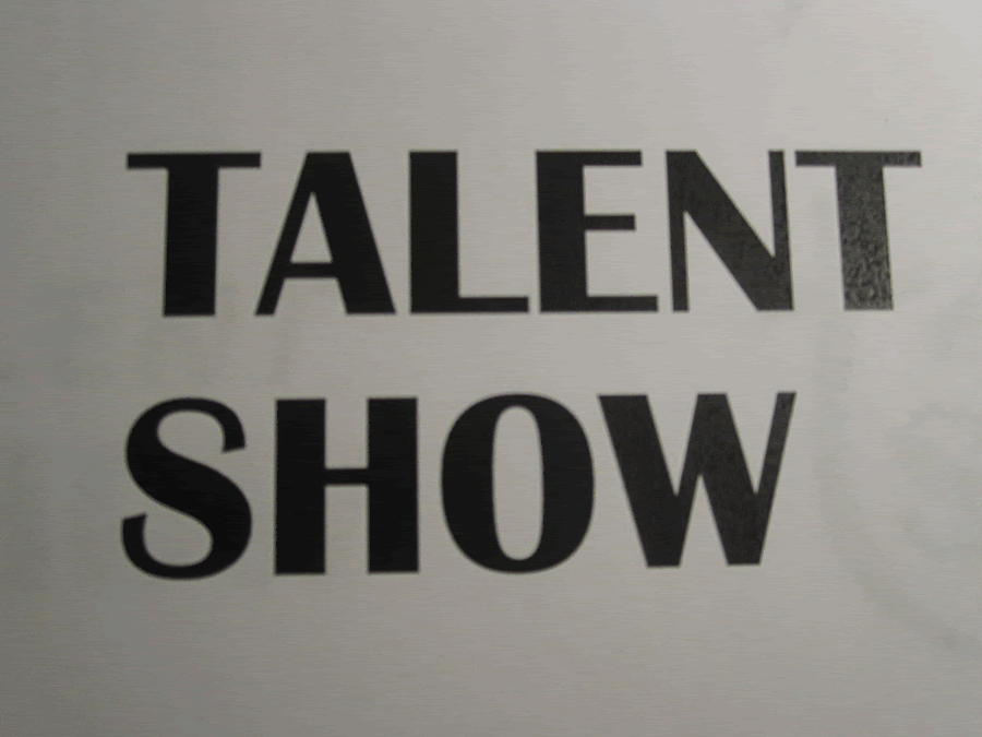 This should have been the selected font (Britannic Bold).
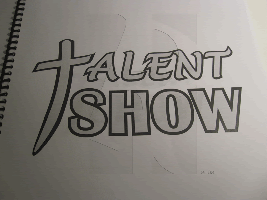 Needed to follow the structure but now I feel like too much is going on.
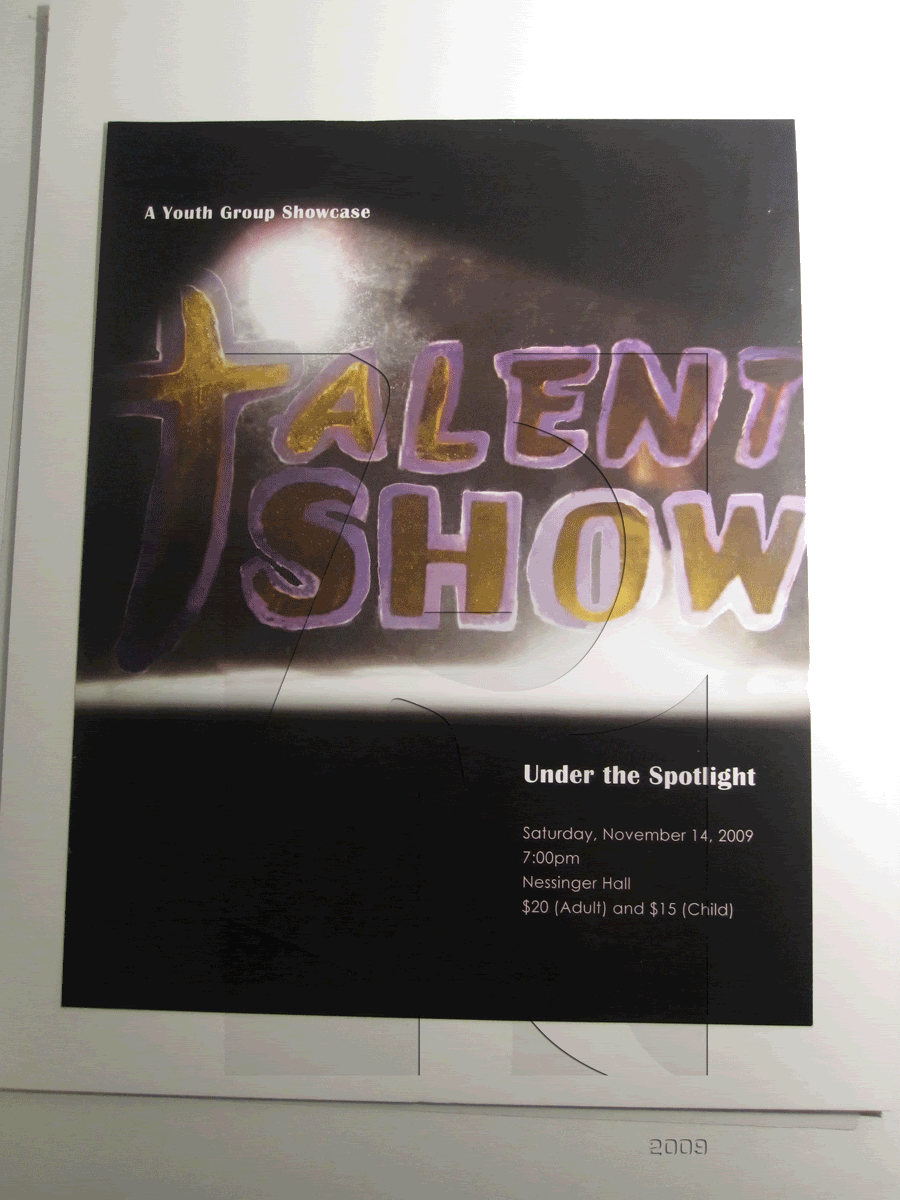 The hand-made type needed to be applied to the flyer to promote the event. Didn't really like the re-make since it lost a lot of direction.
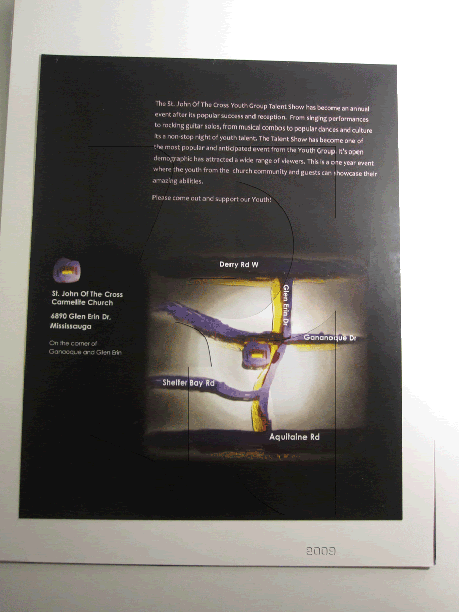 The paragraph format is sick but is the map even that clear?