 This was the main visual i was trying to achieve, the stage, the energy, the flow, and artistry that the show presented.
 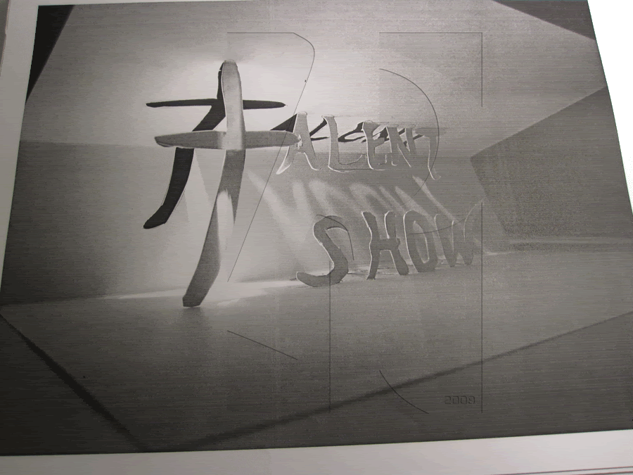 This was my second approach playing around with the pop-up but i found it too serious.
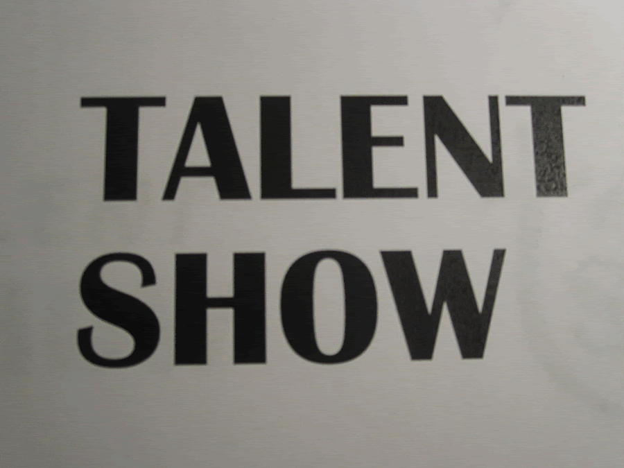 This should have been the selected font (Britannic Bold).
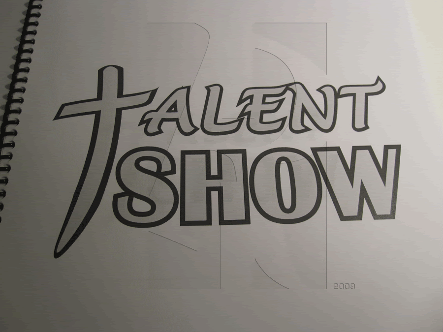 Needed to follow the structure but now I feel like too much is going on.
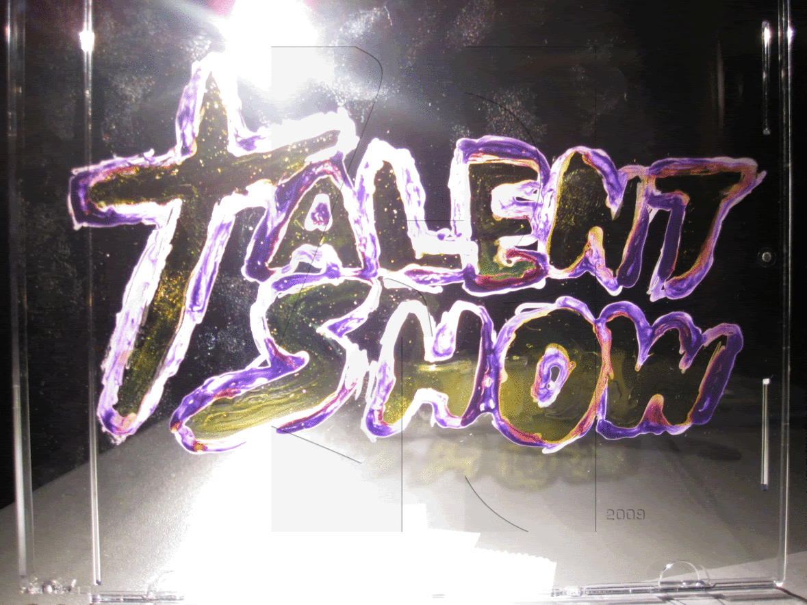
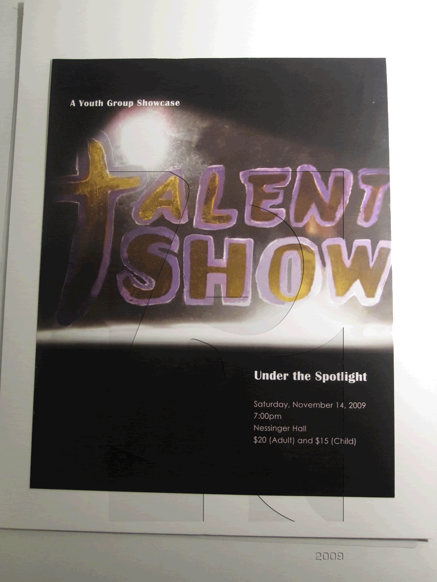 The hand-made type needed to be applied to the flyer to promote the event. Didn't really like the re-make since it lost a lot of direction.
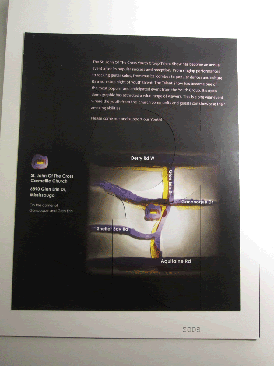 The paragraph format is sick but is the map even that clear?
I really wanna get back to improving this project during the summer. I felt I didn't have enough time to really work on properly executing the hand-made text plus I was making this till 2am and the re-make even later into the morning.


No comments:
Post a Comment